
Most dashboard projects start with a list of charts.
Traffic. Revenue. Signups. Funnel. “And something with a map if we can.”
The build finishes. The room applauds the colors. Two months later nobody opens the board except for a quarterly screenshot, and every real decision still happens in a spreadsheet someone trusts more than the warehouse.
The failure is rarely the chart library. It is that no tile was attached to a decision with an owner.
We build operational dashboards the other way around: decision first, metric contract second, visual third.
A number without a next action is interior design.
What a dashboard is for
A dashboard is not a museum of everything the database can compute.
It is a shared instrument panel for a small set of recurring decisions:
- Do we hire / reallocate this week?
- Is the release safe to keep shipping?
- Are we missing SLA, and who acts?
- Did the campaign pay back enough to extend budget?
If a tile cannot change behavior when it turns red, it is curiosity. Curiosity belongs in ad-hoc analysis, not on the home screen that trains executives to ignore numbers.
The metric contract
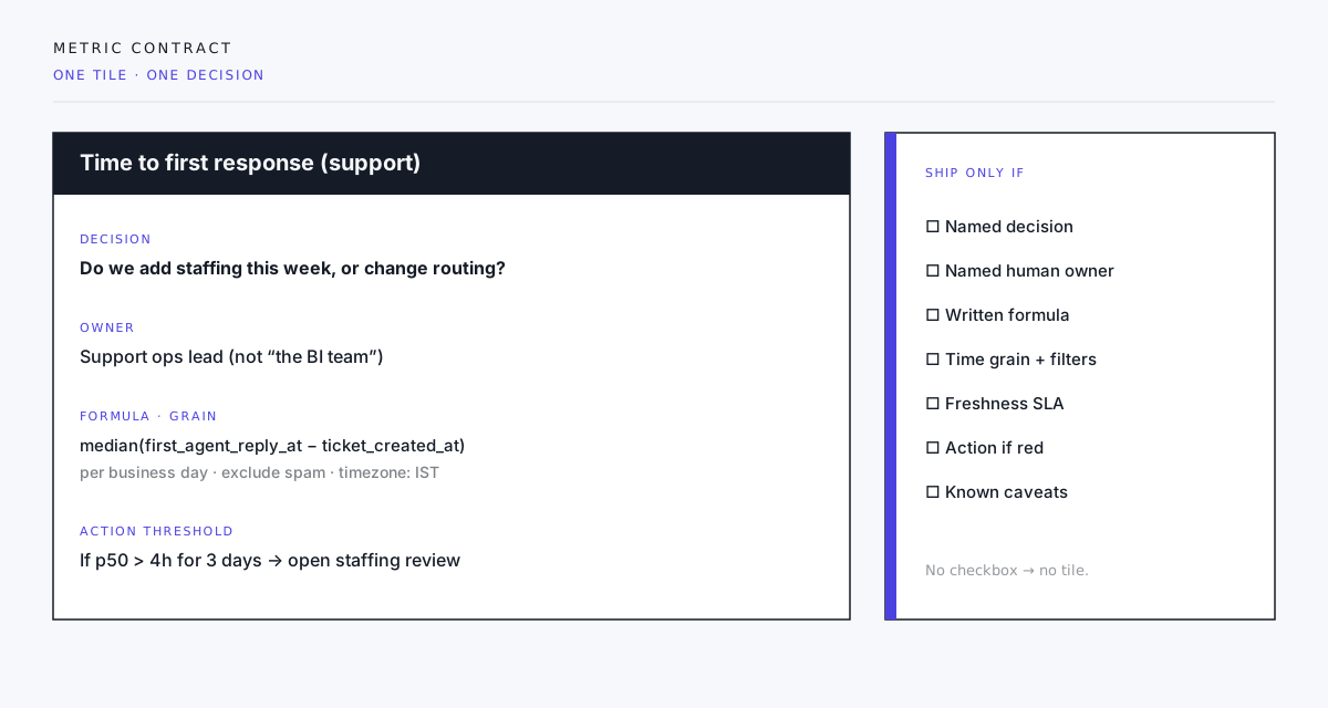
Before layout, every primary metric gets a one-page contract. If the team will not write it, the tile does not ship.
Required fields
| Field | Purpose |
|---|---|
| Decision | What question this number answers this week |
| Owner | A human role, not “data” or “product” |
| Formula | Exact definition, including joins and exclusions |
| Grain | Per day / week / account / ticket — one grain |
| Filters | Default segment (region, plan, spam rules) |
| Freshness | How stale is allowed before the tile shows warning |
| Action threshold | What “red” means and what happens next |
| Caveats | Known lies, lag, and double-counting risks |
Example that works:
Decision: whether support needs temporary overflow staffing.
Owner: support ops lead.
Metric: median time to first human response.
Grain: business day, IST.
Exclude: spam and auto-closed tickets.
Red: p50 over 4 hours for three consecutive days → open staffing review with capacity sheet.
Example that does not:
“Engagement” as a blended score of opens, clicks, and time-on-site with no owner and no threshold.
Fewer tiles, higher trust
A useful board often has six to twelve primary signals, not forty.
Crowding creates three failure modes:
- No hierarchy — everything is bold, so nothing is.
- Contradicting definitions — “active user” means three things on one page.
- Slow load / stale refresh — the board becomes the thing people wait on, then abandon.
Prefer:
- One north-star operational row (the decisions that pay salaries)
- One diagnostic row (why the north star moved)
- Optional experiment / campaign section with explicit end dates
When a campaign ends, remove its tiles. Dashboards rot when temporary charts become permanent furniture.
Definitions beat dimensions
Teams fight about bar vs line. The real fight is definition.
“Revenue” without recognizing refunds, tax, currency, and booking vs cash will lose every executive debate. “Activation” without a time window and a qualifying event becomes a political number.
Write definitions in the same repo or wiki the pipeline uses. The dashboard should link to the contract, not invent a hover tooltip that disagrees with dbt.
When finance and product disagree, the dashboard’s job is to surface the two formulas — not paper over them with a blended vanity index.
Freshness is a feature
A green number that is three days late is a false calm.
Show:
- Last successful refresh time
- Expected cadence (hourly, daily, weekly)
- Degraded state when the pipeline fails (not a silent old value)
If the warehouse job failed, the honest UI is “data unavailable,” not yesterday’s comfort.
Layout that serves scanning
Operational users scan under time pressure. Design for that:
- Top-left: the decision metrics, large, quiet
- Thresholds: visible without opening a filter drawer
- Comparisons: previous period and target, not six overlapping series by default
- Drill-through: to a filtered table or ticket list, not to another dashboard of equal density
- Empty and error states: written for humans (“No tickets in range” / “Refresh failed at 06:12”)
Color is a signal, not a brand playground. One accent for attention. Greys for structure. If everything is red-amber-green candy, nothing is urgent.

Most boards stop at the first panel: noise. The work is getting to a signal someone will act on.
Build sequence we use
- List decisions for the next 90 days (workshop, not a survey form with 40 metrics).
- Write metric contracts for the top five to eight.
- Prove the SQL / pipeline against known edge cases before UI.
- Ship a thin board with freshness and thresholds.
- Watch usage for two weeks — who opens it, which tiles drive tickets.
- Delete or demote what no one uses; promote diagnostics only when a decision needs them.
Skip straight to Figma and you will decorate the wrong questions beautifully.
Anti-patterns that keep showing up
- Executive vanity walls — big numbers with no grain or caveat.
- Real-time cosplay — second-level refresh for a weekly decision.
- Map for the sake of map — geography when the decision is not geographic.
- Screenshot culture — if the only consumer is a slide, automate the slide and skip the live board.
- One dashboard for every team — different decisions need different boards with shared definitions, not one infinite canvas.
When a dashboard is the wrong product
Sometimes the answer is an alert, a weekly email digest, or a notebook for analysts.
Build a live board when:
- Multiple people must share the same operational truth
- Thresholds should interrupt a routine
- Drill-down to action systems matters
Do not build a board when:
- One person runs a monthly report
- Definitions are still political and unowned
- The data is not trustworthy enough to drive staffing or money
Closing
Charts are cheap. Agreed definitions and owned thresholds are not.
Start with the decision. Name the human who acts. Write the formula until finance and ops can both live with it. Only then pick the visual.
If your dashboard project begins with “we need more charts,” you are already optimizing for decoration. Begin with “what will we do differently when this number moves?” — and only ship tiles that have an answer.
Scoping an ops or product dashboard? Start a project inquiry with three decisions you make every week and the number you wish you trusted. That is enough for a metric-contract workshop.