
The retrofit week is a ritual.
Design freezes. Engineering ships. Marketing books launch. Someone runs an automated scan, opens forty tickets titled “color contrast,” and the team spends five days swapping hex values while the keyboard still dies inside a custom select.
That week is not accessibility. It is debt collection.
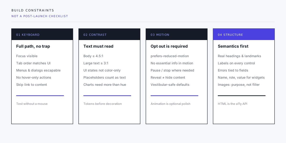
Accessible interfaces come from constraints you accept when components are still cheap to change: keyboard paths, contrast tokens, motion policy, and semantic structure. WCAG 2.2 (and related guidance) is the shared language for those constraints — not a final boss after QA.

Access is part of the path, not a sticker on the door.
What “constraint” means in practice
A constraint is a rule that blocks a design or PR when broken — the same way “mobile layout must not overflow” blocks a PR.
Examples that change outcomes:
- No interactive control ships without a visible focus style.
- Text tokens are contrast-checked against their surfaces before they enter Figma-to-code handoff.
- Any animation longer than a tasteful transition has a
prefers-reduced-motionpath. - Custom widgets document name, role, and value — or they do not merge.
If the only rule is “we care about a11y,” you will get goodwill and regressions.
Four constraints that catch most product damage
We do not pretend a short essay replaces a full WCAG audit. We do insist these four are non-negotiable on marketing sites, product shells, and dashboards we ship.
1. Keyboard: a complete path
If a task can be done with a pointer, it must be doable with a keyboard alone: open the menu, choose an item, submit the form, dismiss the dialog, leave the widget.
Common failures:
- Focus rings removed for aesthetics
- Custom dropdowns that open on hover and ignore Enter / Escape
- Modals that do not trap focus — or trap it forever
- Carousels and tabs that only respond to click
Test: unplug the mouse (or ignore the trackpad) and complete the primary journey. If you cannot, neither can many of your users — temporarily or permanently.
2. Contrast: readable by default
WCAG sets measurable contrast minimums for text (commonly 4.5:1 for normal text, 3:1 for large text) and expects UI state not to rely on color alone. Placeholders, disabled styles, and chart series fail here constantly because “muted grey on soft tint” looks refined in a dark studio and disappears outdoors.
Fix at the token layer: body, muted, inverse, and accent each have approved pairings. Do not invent one-off greys in a hero.
3. Motion: optional polish
Decorative motion must not be required to understand the interface. Respect prefers-reduced-motion: cut or replace large transforms, parallax, and auto-playing flourishes. Never hide primary content behind an animation that only runs when JavaScript and motion are both enabled.
If the page is blank until a reveal class fires, you have an accessibility bug and a reliability bug.
4. Structure: HTML as the API
Screen readers and browsers already understand headings, lists, landmarks, labels, and buttons. Re-building them with div plus click handlers means you re-implement accessibility by hand — and usually incompletely.
Forms need durable labels and error text tied to fields. Images need purpose-driven alternatives (or empty alt when purely decorative). Live regions should be rare and intentional, not a dumping ground for every toast.
Put constraints in the workflow, not the backlog
Design
- Spec focus, error, and disabled states — not only default and hover.
- Call out hit targets and non-color status (icon + text).
- Mark decorative vs informative images.
Engineering
- Component library owns focus styles and keyboard behavior once.
- Lint and CI can catch some contrast and landmark issues; they cannot replace keyboard testing.
- Prefer native elements; when you must go custom, follow established patterns (disclosure, dialog, combobox) instead of inventing a third menu primitive.
Content
- Heading order is an information architecture job.
- Link text should make sense out of context (“Download pricing PDF,” not “Click here”).
- Media transcripts and captions are content deliverables, not engineering favors.
QA
- Automated scans are a net, not a certificate.
- Manual keyboard pass on critical flows every release.
- Spot-check with a screen reader on the homepage, nav, form, and one dense view (table or dashboard).
The cost of waiting
Retrofitting hurts because accessibility defects are often architectural:
- A design system without focus tokens
- A router that steals focus on every soft navigation without announcement
- A canvas chart with no text equivalent
- A marketing animation that is the only way to see the value prop
Early constraints look slower in week one. They are faster than rebuilding a component family after legal, procurement, or a lost enterprise deal makes accessibility non-optional.
What we refuse to call “done”
- “We added alt tags” while the checkout still requires a mouse
- “Lighthouse accessibility 100” on a page that fails keyboard and zoom
- “We’ll do a full audit later” with no owner and no budget
- “Accessible PDF” as a substitute for an operable web form
Done means a defined set of user journeys is operable with keyboard, perceivable under contrast rules, usable with reduced motion, and structured so assistive tech can navigate — and that regression is someone’s job after launch.
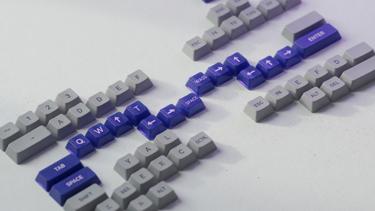
If the journey does not exist on the keyboard, it does not exist for a large part of your audience.
A short acceptance list for public sites
Use this on every marketing or content release:
- Skip link works; main landmark exists.
- Primary nav and mobile menu are keyboard-complete.
- Focus is always visible on interactive elements.
- Body and UI text meet contrast on real backgrounds (including images with overlays).
- Forms: labels, errors, and submit without a pointer.
- Reduced motion does not remove information.
- Headings outline the page without skipping levels for style.
- Decorative images do not pollute the accessibility tree.
Enterprise products will need deeper audits, VPAT language, and specialized widgets. The list above still prevents the embarrassing class of failures.
Closing
Accessibility is not a layer of paint. It is whether people can use what you shipped.
Write keyboard, contrast, motion, and structure into the definition of ready — the same way you write performance and security. Use WCAG as the shared rubric, not as a panic PDF in the last sprint.
If your plan still says “a11y pass after visual QA,” you have scheduled a retrofit. Move the constraints left. The work gets smaller, the product gets more honest, and you stop paying interest on doors nobody could open.
Need an accessibility pass baked into a redesign or design system? Start a project inquiry with the journeys that must work without a mouse. That is enough to scope constraints and testing.